
If you’re running a print-on-demand side hustle, ensuring your products meet customer expectations is critical. One common challenge, especially in Direct-to-Garment (DTG) printing, is achieving accurate colors that match your digital designs. In this blog post, I’ll walk you through a simple but effective method to fine-tune colors and improve consistency using a color chart. This strategy not only saves time and resources but also helps keep your customers happy.
The Problem: Color Inconsistencies
From time to time, you may notice that the colors printed on your DTG products don’t exactly match what you see on your screen. For example, a design intended to feature a Kelly green might end up looking more like lime green after printing. This discrepancy can be frustrating for both sellers and buyers. While some adjustments can be made in your RIP software, such as tweaking contrast or color saturation, these methods often involve trial and error and can result in wasted materials.
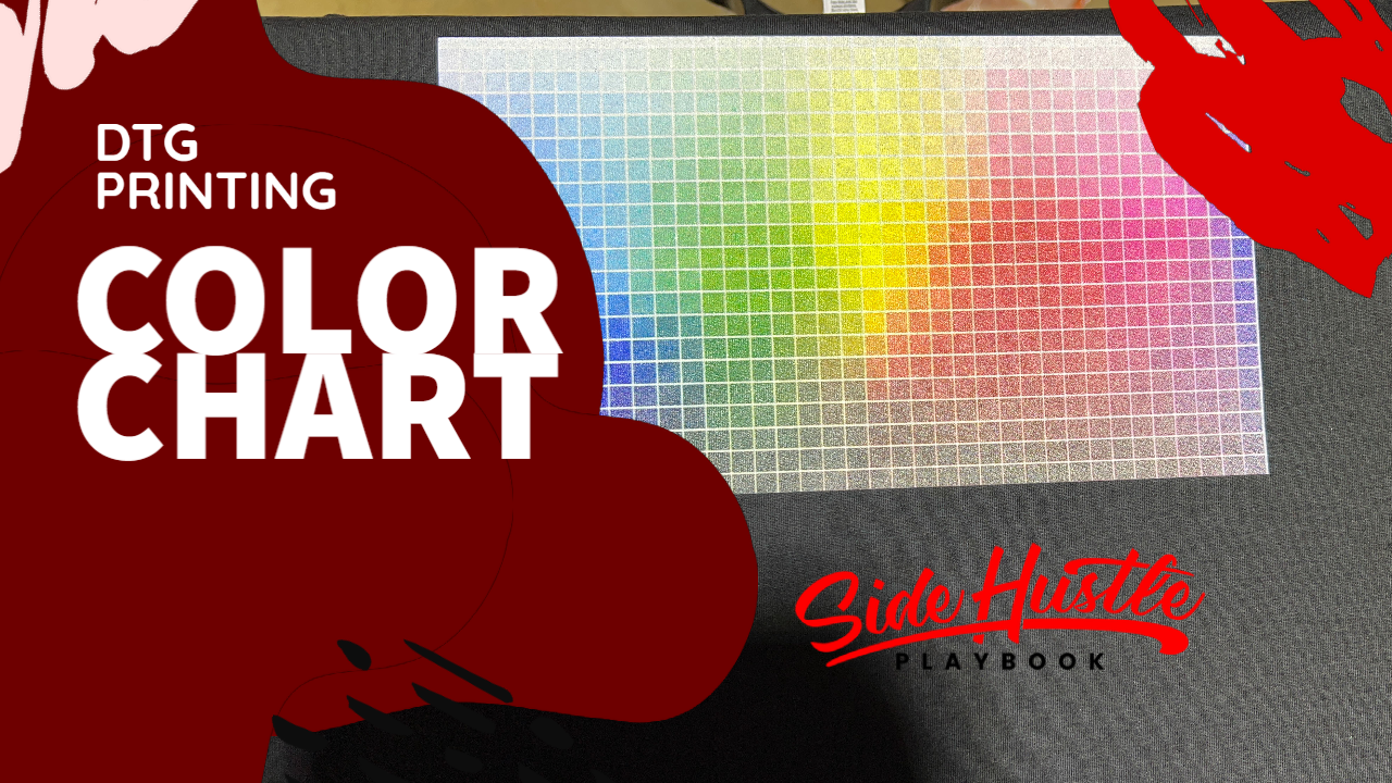
The Solution: Printing a Color Chart
To address this issue, I decided to create and print a color chart directly onto a t-shirt. Here’s how this method works and why it’s effective:
- Use a Color Chart: Begin by downloading a color chart file online. This chart contains a wide range of colors, along with their corresponding HEX codes. Open the file in Adobe Illustrator (or your preferred design software) and export it as a PNG file.
- Prepare the Image for Printing: Import the color chart into your RIP software. In my case, I use Anarip for DTG printing. Make sure to enable an underbase layer, especially if you’re printing on darker garments. Adjust settings like quality (I use “Super Fine”) and select content-based underbase if needed.
- Print the Chart: Load a black t-shirt (I recommend using Bella Canvas 3001 for consistency) and print the chart. Be sure to cure the print properly using a heat press to ensure durability. This will give you a visual representation of how each color appears when printed on your chosen substrate.
- Use the Chart for Reference: Once the chart is ready, compare the printed colors to their digital counterparts in your design software. Identify the HEX codes of the colors that closely match your desired outcome. These codes can then be applied to future designs to achieve more accurate results.
Why This Works
Printed colors often look different due to the RGB (screen) vs. CMYK (print) color models. By creating a physical reference, you’re essentially creating a “cheat sheet” that eliminates much of the guesswork. This is especially useful for colors that frequently cause issues, like greens. Having a reliable reference saves time and minimizes waste, as you’re less likely to print multiple test shirts to get the color just right.
Bonus Tips
- Don’t Discard Test Shirts: If a shirt doesn’t come out as expected, reuse it for future test prints by printing on the back or other unused areas.
- Maintain Consistency: Stick to the same shirt brand and type to ensure consistent results across all prints.
- Test Settings: Experiment with your RIP software settings, like enabling or disabling content-based underbase, to see what works best for specific designs.
Final Thoughts
Color consistency is a small but crucial detail that can set your business apart. By taking the time to print a color chart and reference it during the design process, you’ll not only improve your product quality but also enhance your customer satisfaction. Remember, happy customers are repeat customers!


