
If you’re in the t-shirt printing business, you know how frustrating it can be when colors don’t turn out as expected. The struggle is especially real when working with tricky shades like greens, reds, or purples. In this post, we’ll break down how to use a color map to achieve consistent and accurate results with your prints, specifically for the RICOH RI 1000 Direct-to-Garment (DTG) printer.
Whether you’re selling on Etsy, running your own store, or just trying to save on wasted prints, these tips will help you produce vibrant, professional-quality designs that match your customers’ expectations.
Why Color Accuracy Matters
Color accuracy can make or break your t-shirt printing business. Imagine shipping a shirt with a kelly green design, but the customer receives a lime green version instead. That mismatch can lead to complaints, returns, and even negative reviews.
This is why taking the extra step to fine-tune your colors—especially with tools like a color map—can save you time, money, and headaches down the road.
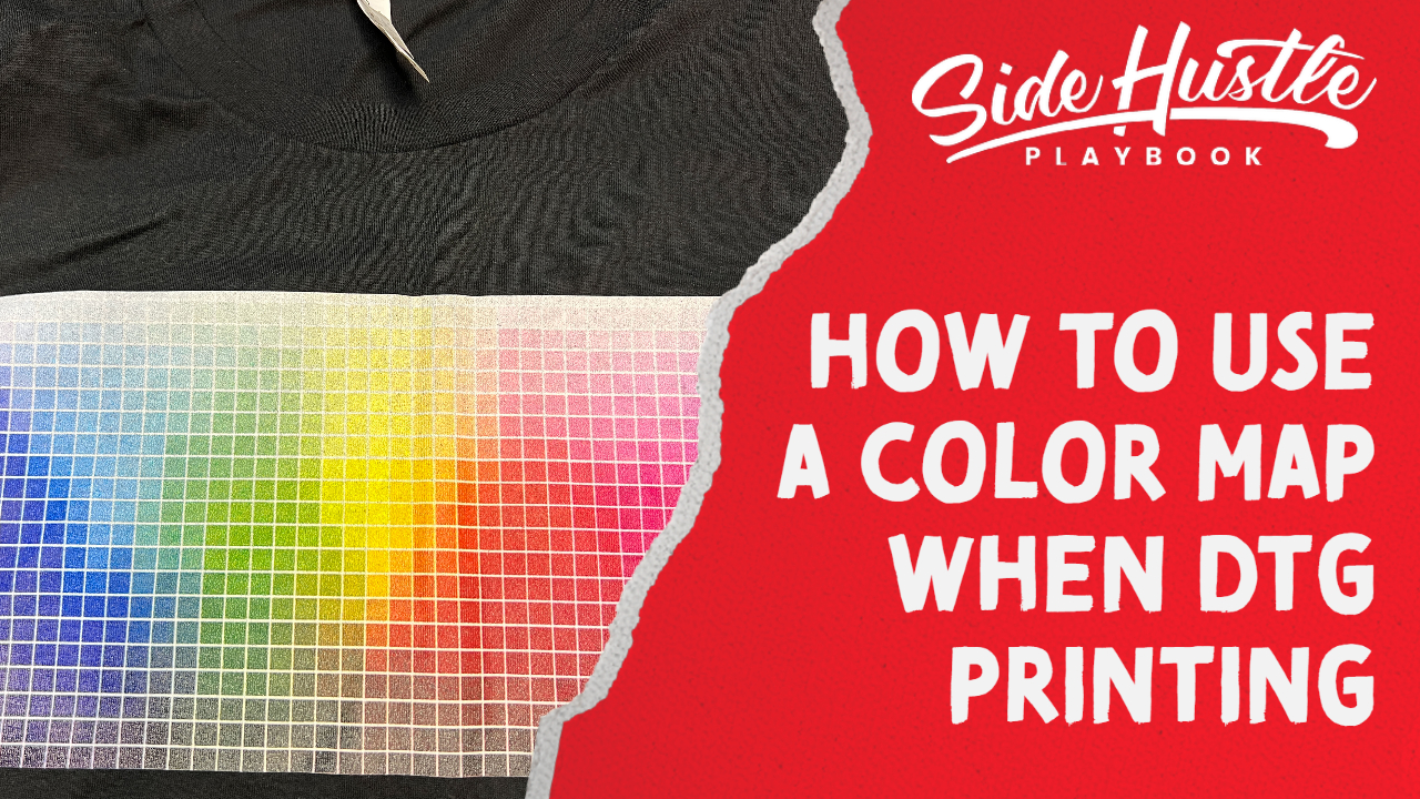
What Is a Color Map?
A color map is essentially a printed guide that shows various color samples directly on a shirt. By referencing the map, you can see how different shades look on fabric under real-world conditions.
When working with the RICOH RI 1000, colors like kelly green often translate incorrectly during printing. Using a color map allows you to pinpoint the exact shade you want and adjust your design in software like Adobe Illustrator or Photoshop before sending it to print.
Step-by-Step: How to Use a Color Map for Accurate Prints
1. Print a Color Map on Your Target Shirt Color
Start by printing a color map on the type of shirt you’re having trouble with. For example, if you’re working with green lettering on a black shirt, print the map on a similar black shirt.
2. Select the Desired Shade
Once the color map is printed, identify the shade you want. Use design software like Adobe Illustrator to match the exact color code. This is typically done using the color picker tool.
3. Adjust Your Design
Update your design with the selected color codes from the map. Be sure to save these codes for future reference to maintain consistency across multiple prints.
4. Prepare Your Print File in Anajet RIP Software
Load your updated design into the Anajet RIP software. Here are a few key settings to keep in mind:
- Shirt Color: Match it to your actual shirt (e.g., black).
- Print Quality: Choose “Super Fine” for higher detail.
- Underbase Settings: Enable underbase and adjust the choke to avoid white outlines under the design.
5. Print and Review
Print your shirt and review the results. If everything matches your mockup, you’re good to go. If not, fine-tune your color codes or RIP settings as needed.
Key Benefits of Using a Color Map
- Save on Wasted Prints: Avoid trial-and-error printing by testing colors beforehand.
- Ensure Customer Satisfaction: Deliver products that match the colors shown in your listings or mockups.
- Boost Efficiency: Spend less time tweaking settings and more time fulfilling orders.
Tips for Better Results
- Keep a Record of Color Codes: Save your preferred color codes for consistency across orders.
- Enable Highlighting for White Text: If your design includes white text, adding a highlight layer can make it pop.
- Optimize Drying Time: Allow a brief delay between printing the white underbase and the color layers for better adhesion.
Why This Process Works
When printing with the RICOH RI 1000, some colors—especially greens—don’t always translate well from digital designs to fabric. By using a color map, you eliminate the guesswork and achieve colors that align with your vision and your customers’ expectations.
Final Thoughts
Achieving accurate colors in DTG printing can feel like a daunting task, but with tools like a color map, it’s entirely possible to deliver high-quality, vibrant designs. By following these steps, you’ll not only reduce wasted prints but also improve customer satisfaction, boosting your reputation as a reliable t-shirt printer.
Have questions about t-shirt printing or color maps? Drop a comment below or visit our blog at Side Hustle Playbook for more tips and tutorials.


